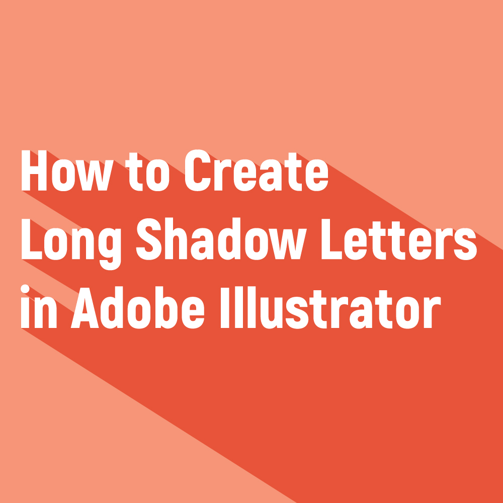
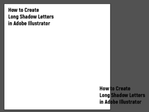
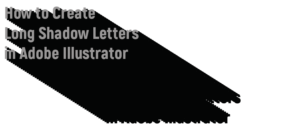
I have been seeing a lot of long shadow designs lately and I thought I would share with you an easy way of creating your own. There is going to be two versions of this tutorial one that is slightly less labor intensive and one that I like to call the perfectionist’s version. I thought I would teach you my process of making long shadow letters by showing you how I made the title image for this post.
Let’s get started!
Step 1:
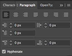
Type out your words or sentences and arrange them so your words are left aligned. If you are only working with a few words on the same line you don’t need to worry about them being left aligned. You can find the type tool by pressing T on your keyboard. Typically Adobe Illustrator defaults to left aligned letters, but if for some reason your type is not left aligned you can change it by going up to window in the top toolbar, scrolling down to type, and clicking on paragraph. You can then click on the left align text button at the top left of your type options box that looks like this:
Step 2:
Hold down Alt and drag your text diagonally to the right. By holding down Alt as you drag your text, you are copying your sentence so make sure you don’t let go of Alt until you have dropped your sentence in place. Depending on how diagonal you want your shadow to be, you might need to drag your letters off of the artboard which is perfectly fine for this tutorial.
Step 3:
Select both of your sentences and in the top toolbar go to object, blend, blend options. During this step, you can do one of two things.
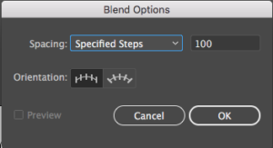
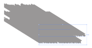
Play around with your blend options. Spacing should be changed to specified steps. How many specified steps you want depends on how much work you want to do. If you what the blend tool to do most of the work you can set your specified steps to a large number like 300 or 400. The problem with this technique is if you zoom in really close to the type you will notice that Illustrator has created a really tiny zigzag pattern to connect the letters. A lot of designers teach this method, however, I find fault with this technique for 2 reasons. I have a really slow computer that is triggered by how many anchor points this technique has. I also am a perfectionist and even though people might not be able to see the small zigzag lines, I know they are there so I have to get rid of them. To make the work of erasing the zigzags easier I am going to move my shadow lettering at the bottom closer to the top sentence and set my spacing to a smaller more manageable number. The only thing is you have to make sure the number is big enough so your shadow is sold black. In other words, make sure your letters don’t look like this:
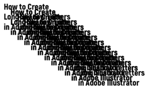
I ended up moving my shadow sentence a lot closer to the top sentence and changing my specified steps to 50 which made my lettering look like this:
Step 3:
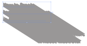
Grab your new letter creation and go to object in the top toolbar and click expand or expand appearance depending on which one is showing. It should open a popup that has expand object and fill selected. Ignore this box and just press ok. Your top and bottom sentences that are selected in the picture above will still be in type form which we don’t want.
For now, using your direct selection tool (A) and grab the very bottom sentence which you can find because it has the horizontal type lines underneath the sentence. Go to object and expand again. If you are having trouble finding the lines you can reference the picture above.
Step 4:
Select your top sentence using the direct selection tool (A) and copy (Control-C) and paste it in place (Control-F). Make sure your top sentence is still selected and press Control-2. This should lock your top sentence in place so later you can edit that separately from the shadow. You can find your top sentence the same way you found the bottom sentence in step 3.
Step 5:
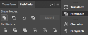
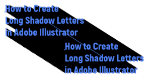
Select all of your lettering minus the top lettering you locked and go to your Pathfinder panel in your right side toolbar and click on the box in the upper lefthand corner to unite your letters. Select your shadow and press Control-G. This will ungroup your shadow from your top letter. Select your shadow again and move it to the back of your artboard by pressing control and clicking on your shadow. Scroll down to arrange and press send to back.
Step 6:
Unlock your top sentence (Alt-Control-2). Change your top sentence to a color separate from the shadow color. At this point, it doesn’t matter what color you change the sentence too. We can mess with the color later.
Step 7:
If you decided to go the easier route and change the specified steps to a large number over 200 when you blended your sentences, then your long shadow is done and you can now develop your colors. For the perfectionists who created a much smaller blend of around 50, now comes the tedious task of deleting your anchor points that are making the zigzag patterns on your shadow. Make sure your top sentence is locked (Control-2). Select the minus tool on your keyboard. This is the keyboard shortcut for the delete anchor point tool. You can then scroll over anchor points and delete them.

The goal is to make the shadow line up with the corner of the top of the letters. In order to do this, you must start with the anchor point that is second to the top of your letters. To give you an example of what your letters should look like, here is a picture of what the top of the H looks like after I deleted the anchor points.

Things that are rounded like the O in “how” are slightly more difficult.

To make sure the line connecting the O and the W is not curved grab one of the anchor points and drag its handles inward to create a straight line. Do the same thing with the other anchor point.

You then want to drag the anchor point touching the O upward so it lines up with the side of the O like so:

You now can see that the O has a bump on it. Select the anchor point and use the anchors handle to tuck the bump behind the O. You want to make sure the diagonal line connecting the O and the W is the same angle as the diagonal line connecting the H and the O. The way I like to compare the angles is by drawing a line using the pen tool (P) that mirrors the diagonal line between the H and O. I can then drag that line between the O and W and compare and adjust angles if needed. Continue deleting your anchor points until all zig zags are deleted.

Don’t worry about deleting the anchor points on the bottom of your shadow. To get rid of those anchor points you can select the eraser tool (E) and while holding shift, drag your eraser tool across your shadow to separate the bottom anchor points from the shadow.

You can then delete the bottom shape you just created with all of the crazy anchor points. This will shorten your shadow quite a bit so if you need to make it longer you can select your two bottom corner anchor points and drag them out.
Step 8:

Make sure to fill in any holes in your shadow using the blob brush tool (Shift-B). This includes holes like the one under the R in the picture above.
Step 9:
Unlock your top sentence (Alt-Control-2), resize your lettering, change its colors, and you are done.
If you wanted to create different colored shadows for each line you can use the same steps to create individual shadows for each line of text in the sentence. For example, you would need to create a shadow for “how to create”, create another shadow for “long shadow letters”, and create a final shadow for “in Adobe Illustrator”.
I hope you found this tutorial helpful. This tutorial requires that you know basic Illustrator terms like anchor points and handles. If you are new to Illustrator and need extra assistance, leave a comment down below if you have any questions and I will try to answer them. How do you use long shadows in your designs?
If you liked this post, why not share it! It lets me know what posts you like so I can make more posts like this.


White Privilege Syllabus
Your site is so clean and visually appealing. I haven’t used this program in a few years but even still, super clear and easy to follow. Nicely done!
Kelcie Makes Patterns
Thank You! I am always questioning if my readers can understand my posts because I don’t get a lot of feedback so this was very helpful.
Rose
This is so great.I could use a refresher on long shadow letters. Thank you for sharing.
Kelcie Makes Patterns
You’re Welcome!
Emily
Really great article. Thanks for taking the time to explain things in such great detail in a way that is easy to understand!
Kelcie Makes Patterns
You’re Welcome! I am glad this helped.