 Rules:
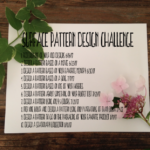
Redesign one of your old designs
Take one of your old designs and turn it on its head. You must change at least 3 things about your design and they all must be from different categories. For example, all of your three changes cannot just be changing the color of three different aspects of your design or just rearranging three different graphics around. There has to be a noticeable difference from your old pattern to your new one. When you are done post your old and new pattern to Instagram side by side.
My Redesign:
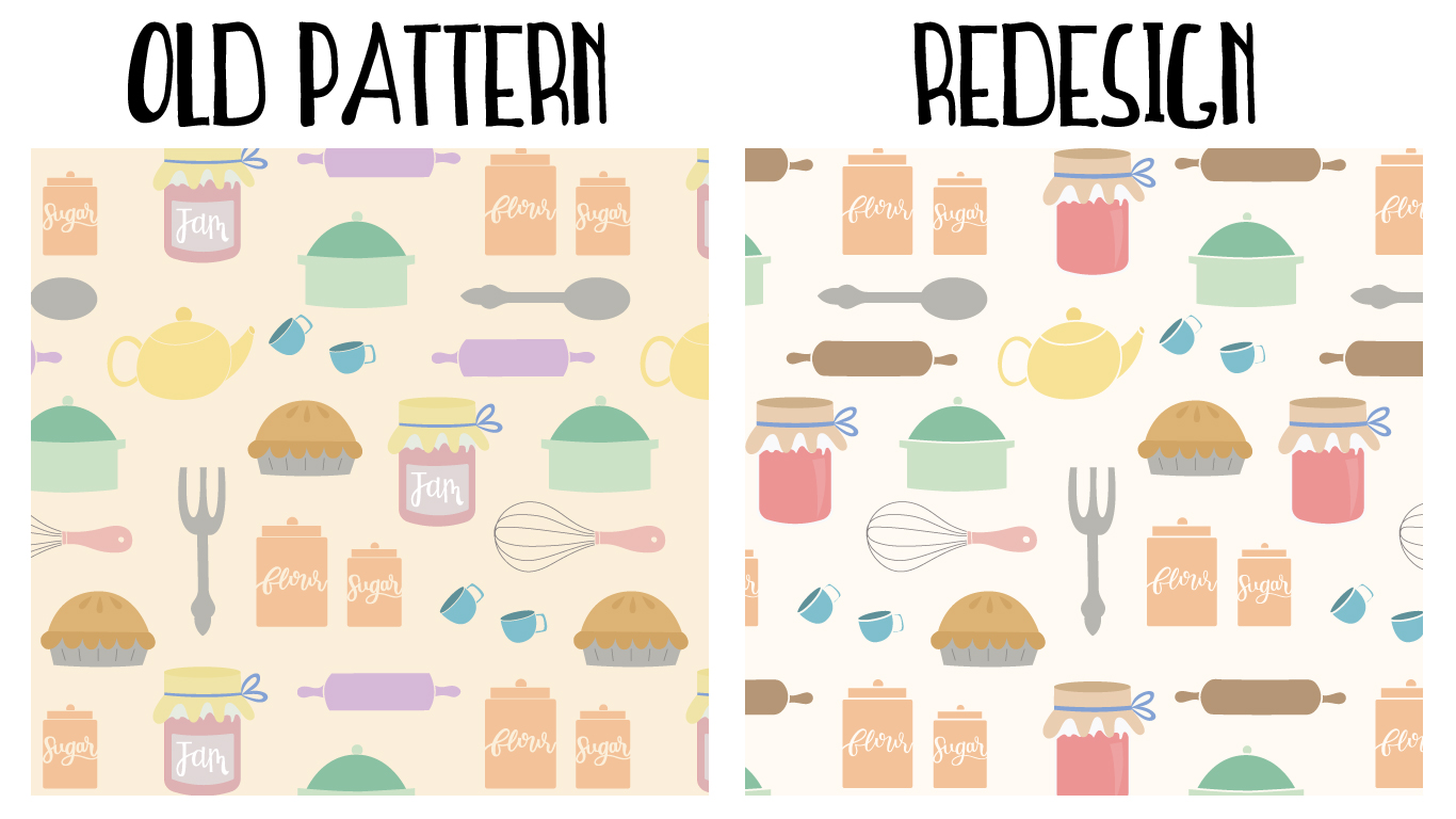
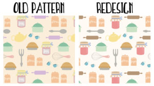
When I thought about the design I wanted to tweak for challenge 1 the first design that came to mind was my Vintage Kitchen pattern. It was one of my first patterns, I did not really know what I was doing (and still don’t), and there were many things I didn’t like about it. For one thing, I chose an awful shade of purple to put on a rolling pin. I also made a label for the jam jar that I did not particularly like, I chose 2 competing shades of yellow, and thought I could get away with creating the glass on the jam jar by applying a light blue color and turning the opacity way down . . . Yikes.
So what did I do to redesign the pattern? Most notably I changed the background color. The background had a slightly yellow tint that was competing with a few of the colors in the design, particularly the yellow on the teakettle and the jam jar lid. To put it bluntly, the color combinations were hurting my eyes and you never want that to be the case.
Another thing I had a visceral reaction to every time I saw it was the purple rolling pin. I wold look at the pattern and my mind was imminently drawn to that bright purple, doesn’t match anything purple and I had to get rid of it. I changed the purple to a normal brown color that you would see on a traditional rolling pin and reshaped the rolling pin to give it slightly more rounded corners.
Then came the daunting task of fixing the mess that was the jam jar. I took out the jam label, got rid of the awful transparency glass, and added a little glass highlight.
Lastly, I increased the stroke widths on some of the objects. The reason I did this was I wanted to create a sense of space between certain aspects of each object. For instance, the casserole dish has a space between the lid and the base of the dish. Certain objects like the rolling pin were starting to look like blobs of color and I wanted to give them definitive lines of separation and depth.
This is one of those patterns that I will come back to when I gain more skills and continually update it, but for now, this will do.
If you want to join the design challenge you can find a list of all the design challenges here.