
Last week I talked about my Top 5 Free Fonts for Graphic Designers. This week I wanted to talk about how you can take those free fonts and make them your own. If you are on a tight budget, taking a basic font and altering it to make your font stand out is a great way to give your client a unique design without costing your client money in licensing fees. In this post, I will discuss 5 easy tips and tricks that even the novice graphic designers can use to add dimension to their designs.
So let’s get started!
Preparing a Font to be Altered
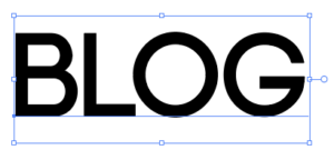
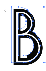
Before I go into different techniques you can use to alter a font, we need to prepare the font first. This should be done everytime you want to manipulate a font in your design. You will notice in the picture above that the font doesn’t have anchor points around each letter. This restricts you from making any major changes to your font. To make your font adjustable go to object then expand. You can see now that you have a bunch of anchor points around your letters which you can then manipulate or change using tips from this tutorial. Expanding your fonts is also a good thing to do in general with your designs because if the client does not have a font they won’t be able to print it. I made a seating chart for my sister’s wedding once in this beautiful script font and when I took it to get printed I had to go back multiple times because I forgot to expand my font.
Now that we have prepared our font let’s get on to the fun part.
Tip #1: Changing a Fonts Weight

Most fonts especially free fonts only come in one weight. You rarely come across a free font that comes in more than one or maybe two weights, but it is really easy to change the weight of a font by going to object in the top toolbar, scrolling down to path, and clicking on offset path.
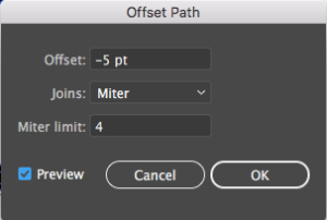
An offset path options box will pop up which will change the weight or thickness of your font. To make a font thicker you can add any number above zero to the offset box. To make a font thinner, however, you need to include a negative number in the offset box. To see how your font will look when you manipulate the offset box make sure preview is checked at the bottom. Once you press ok delete the original font so only the new font is showing. You may also need to re-kern your letters as the spacing between letters may be too big or too small depending on how much you changed the weight of your font.
Tip #2: Overlap Different Font Weights in Your Design

This tip builds upon what you just learned in the previous tip. Take your already expanded font and go to object, path, offset path. Include a negative number in offset path and press ok. change the inner font you just created to white and that is it.
Tip #3: Creating a Hatched Drop Shadow

I had seen a lot pictures of hatched drop shadows before, but it wasn’t until I saw the font on a dominos pizza box that I thought to combine tip #2 with a hatched drop shadow. To make this easier I have included a file for a striped pattern that you can use for this part of the tutorial. You can find it here:
When you open the striped pattern I provided you need to save it to your swatch library so you can access it in the file you are using to create your font.

Your swatches panel is in your right side toolbar. Click on the three lines in the top right corner of your swatches panel and scroll down to the very bottom where it says save swatch library as AI. Enter a name that you will remember like stripes or striped pattern in the save as box and press ok. To access this stripe pattern in a different file, click on those same three lines in the right corner of your swatches panel, scroll down to open swatch library, go to user defined, and click on your striped pattern.
We are going to use the font in tip #2 to create this look.

Grab the black part of your letters and hold down alt and shift while dragging your letters diagonally up and to the left to create the drop shadow. With the drop shadow letters selected, apply the striped font to the drop shadow. You can do this by following the steps above and locating your pattern in the user defined section of your swatches panel. Once you find your pattern, click on it to apply it to your drop shadow. Rotate your pattern by pressing R and clicking on your artboard anywhere to the left of your letters.
You will notice in the picture above that there is a little target looking marker to the left of the b that is there to tell Illustrator where to rotate. Hold down alt and click on that marker. I usually have to click on the marker twice to get Illustrator to recognize the click. When you do this, a rotate options box will appear.
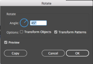
Make sure transform objects is not selected and rotate your pattern 45 degrees. Your font should now look like this:

Your drow shadow should still be selected and now we need to decrease the size of your pattern stripes. To do this go to options, transform, and press scale.
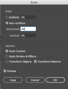
Make sure preview is selected, transform objects isn’t selected, and in the uniform box, decrease the percentage of your pattern until your stripe pattern is at a size you are happy with, press ok, and you are done.
Tip #4: Creating Shadows

To create a shadow for our letters we are going to start out with basic black letters. Copy your letters (Control-C) and paste them in back (Control-B). You want to make sure that you keep the back letters selected so try not to click anywhere else. Also, your letters should be grouped together (control-g). Click on effect in the top toolbar, go to distort and transform, and click on free distort.
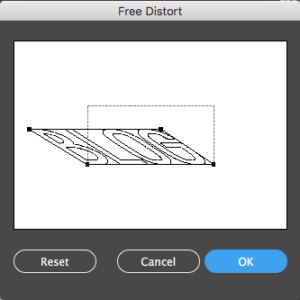
Take the two corner anchor points at the top of your bounding box and drag each one individually down and to the left to create the appearance of a shadow. You might need to play around with this until you get a desired look and press ok.

The last thing you want to do is change the color of your shadow. The way I pick my shadow colors is by making my color slightly darker than the background color. Since the background was white, I made the shadow a light gray. You can change the color of your shadow by clicking on your fill box in your left side toolbar which looks like this.

You then should pick a suitable color that looks good with your background, not your letters.
Tip #5: Long Shadow Letters

I mentioned how to recreate this technique in a previous blog post so if you want to see a step by step guide to creating long shadow letters you can view it here. This is a good way include another layer of dimension to your designs.
So that is 5 of my favorite tips for making free fonts unique. What was your favorite tip?
If you liked this post, why not share it! It lets me know what posts you like so I can make more posts like this.