How to Create a Slanted Square Type Effect in Adobe Illustrator

Today I thought I would show you a quick and easy way to give dimension to your type. I have been seeing many designs where the graphic designer has used a slanted square technique in their type and we are going to try to replicate it here. This tutorial is great for beginners, but can also be scaled up for those who are more experienced with Adobe Illustrator.
Before we begin, the font I used is a free font you can get from the web called Big Joe. It’s free for personal and commercial use and comes in a duo with a thinner font called Slim Joe so if you want to follow along with this tutorial you can download the font here.
Let’s Get Started!
Step 1:
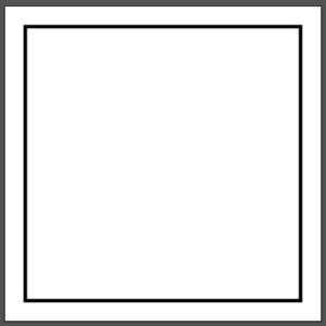
We first want to create guides for our type so we can keep the design uniform. Using the rectangle tool (keyboard shortcut: M), draw a square about a centimeter shorter than your artboard. To make sure your square is in the center of the artboard hover over the center dot of your artboard. The center dot is pink and will only show up when you hover over it. Hold down control and shift when drawing the square. Holding down shift will help the square keep its square shape and holding down alt will draw the square from the center point outward.
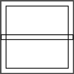
Now create a rectangle using the rectangle tool (M) again. This should be in the center of the square and should be about a centimeter tall.
Step 2:
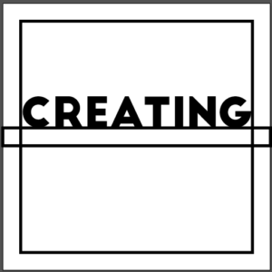
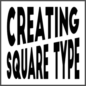
Select the type tool (keyboard shortcut: T) and click anywhere on your work area. Type only what you want to include on the top row of your design. Expand your type so it touches the two sides of your square guide and drag the type to the top of the center guide like in the picture above.
Stretch out your type to fit in the top rectangular guide box like in the picture above.
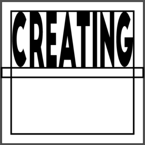
Repeat all of step 2 for the second row of type making sure that you stretch the type so it is touching all sides of the rectangle guides. You no longer need the guide lines so select the square and center rectangle and delete them.
Step 3:
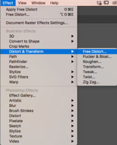
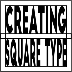
Select your first row of type and go to effect in your top toolbar, scroll down to Distort & Transform, and click on free distort.
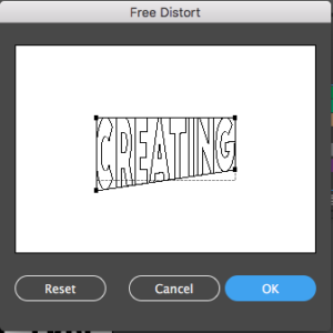
The free distort tool is really easy to use but is also heavily flawed. It only lets you grab 1 anchor point at a time and doesn’t provide you with a live preview option like most of the other Illustrator tools which makes it kind of tricky to align your words perfectly. You are just going to have to play with the distort tool to get your lines as even as possible. Select the bottom left anchor point and drag it down about half a centimeter to a centimeter. Select the bottom right centimeter and drag it up about half a centimeter to a centimeter and press ok.
Select the second row of type and go back to the free distort tool.
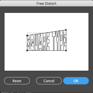
Select the top left anchor point and move it down about half a centimeter to a centimeter making sure to move the anchor point a similar distance to that of the bottom left anchor point of the top row of type. Select the top right anchor point and move it up about half a centimeter to a centimeter. Press ok.
Step 4:
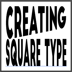
You may notice that after distorting your type that the middle lines are not evenly diagonal. Don’t go back to the distort tool because Illustrator will ask you if you want to apply a new effect which will completely wipe out all of the distort work you did on the type already. Instead, before you go to use the free distort tool select your second row of type and go to object in the top toolbar and click expand or expand appearance. Then you can go back into your free distort tool and make minor changes. In my case, the right part of my “type” font is a little low so I want to drag my top right anchor point up just a little.
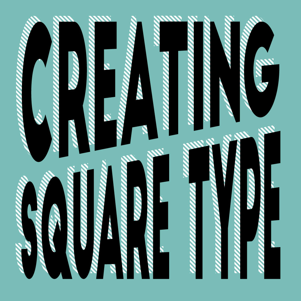
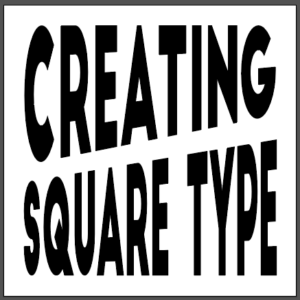
As you can see, the middle lines are not perfectly diagonal, but they look ten times better than the first attempt. Select both rows of type and go to object in the top toolbar, press expand or expand appearance, and you are done.
To give your design even more dimension you can view my previous post on 5 tips for making free fonts unique to learn how to make long shadows, add hatched shadows, add line detailing to the center of your font, etc.
I’d love to see what you make with this tutorial. Leave a picture of your design or a link to your design down in the comments.
If you liked this post, why not share it! It lets me know what posts you like so I can make more posts like this.