I was going through my old designs and I found some designs that I don’t think I have ever shown online before because they are some of my least favorite designs. One of these designs is my very first design so it does give you an accurate depiction of how I have grown over the last few years. I thought this would be helpful for beginner designers to see as most designers only post their good designs. I am guilty of that sometimes, but as I started making designs before I ever started posting them online, you don’t get to see my beginning designs that I was making to get better before I felt confident enough to post my designs online. Get ready because I saw my first design and it was cringeworthy.
My First Design
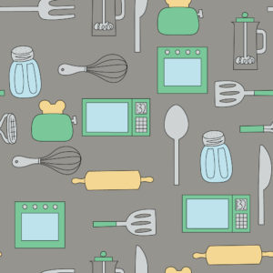
Yep, my first design was a kitchen pattern. I hadn’t viewed this pattern in a while so when I searched for it in preparation for this post, I didn’t think it was going to be that bad. A few things I noticed from this pattern are I was really bad at spacing, I really need to study color theory, and what was I thinking putting back strokes around all of my motifs.
My Second Design
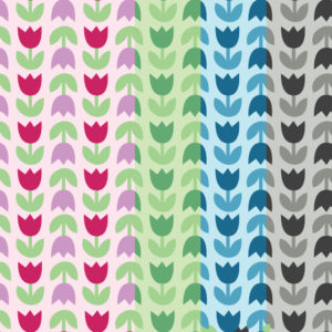
This was somewhat better than my first design but also a lot worse. I remember having so much trouble making this simple tulip pattern. When I made this pattern, I wasn’t familiar with the move tool so I was placing everything by hand hoping they were spaced evenly. By the way, the pattern doesn’t actually look like what it does in the picture above. I made four color options for the pattern and thought it would be good to showcase them by unevenly spacing the different color options in a square.
Handlettering Disaster

When I got Adobe Illustrator for the first time, one of the things I wanted to do was digitize my hand lettering, however, I didn’t realize how hard that would be. I had watched a video on how to use the image trace tool and I had an idea to make this easter design. I really hate the color pallet I chose for this pattern and that swirl on the big E in easter is just plain awful.

I tried to make that hand lettered happy easter look better by adding flowers to it, but my hand lettering could not be saved.
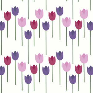
Then I thought I would just take the tulip from the hand lettered pattern and repeat that, but I gave up after that, however, this was ultimately a learning experience.
Flat Flowers
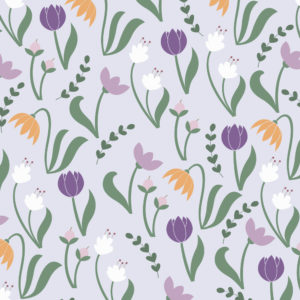
This is probably my best worst pattern on the list, but it encouraged me the most to keep going. I made this pattern very early on when I started learning pattern design and I actually liked it at the time. It was slightly more detailed than all of the other patterns I created and really got me thinking that I could be good at pattern design. This pattern could use some shading and some of the flowers need a little reworking, but it served its motivational purpose.
Back to School Pattern

This is the most recent pattern on the list and is a good example of one of those patterns that you think is going to look good when you create the motifs, but when you put everything together, the motifs don’t really look like they go together. Often, we tend to be more critical of our own desings and I didn’t want this pattern to go to waste so I believe I included this in one of my freebie Fridays. If nothing else, I thought people could take the pattern apart and use the individual motifs for a design of their own.
I am sure I have more designs I could add to this list, but these are some of my earliest, least favorite designs. If you want to contribute to this discussion, include a picture of one of your least favorite designs in the comments down below.
If you liked this post, why not share it! It lets me know what posts you like so I can make more posts like this.


